Work 02 2022 — 2024 Product Designer, design system

Zeta — three surfaces

Teams across the product had each solved “show me one more thing” their own way. A three-day sprint turned eight scenarios into three surfaces that every center inherited.

My job was to work out how many surfaces the product actually needed, and to specify each one end to end.

The before, drawn: a modal covering the datapoints an agent needs behind it, a link from a bundle page landing on the accounts listing instead of the account it named, and along the bottom the same need answered a different way each time, with the same question under each.
opaque: the page is gone the one fact they need it was in the list the same argument, each time
Before The before, drawn: a modal covering the datapoints an agent needs behind it, a link from a bundle page landing on the accounts listing instead of the account it named, and along the bottom the same need answered a different way each time, with the same question under each.
Role
Product Designer, design system
Year
2022 — 2024
Kind
Professional
Surfaces to build
83

8 surfaces3 surfaces

Eight distinct scenarios came out of the sprint, each heading for its own implementation. Three shared patterns fit all of them and were inherited by every product center. The counts are my recollection, accurate to the scenario.

01

Every team had solved “show me one more thing” differently

Two questions open the deck I wrote for the product and engineering leads in August 2023. How might we help users easily access other information in order to complete their task? How might we allow users to navigate, reference and share an entity effectively?

Both are written against Support Center. An agent closing an account or raising a dispute refers to datapoints located across the center, and the modal lightbox in use then obstructed them. An agent on a bundle details page could not get to the account it named. The link put them on the accounts listing.

The product’s scope kept expanding, and the same roadblock came back with each new surface. People were discussing how to move forward implementing this based on the patterns we have. Each team answered that on its own, so the answers did not agree.

02

Ran the sprint before the components

Before any of it was designed we ran a three-day sprint with ten to fifteen designers, the ones who work on product surfaces.

Everyone brought use cases: the scenarios they were trying to solve, the surfaces they had already put together, and the requirements they were working around.

We sorted those and clubbed the recurring ones. Consolidated, they came to eight distinct scenarios. Then we tried other directions against the eight to see whether anything more was necessary. Three patterns fit all of them.

Use-case cards drawn as a loose scatter, pulled into eight labelled groups, three pattern names set beneath the groups, and a small aside of directions tried and set aside.
The sort-and-bucket step, drawn for this page. None of the sprint’s own material survives, so this is a reconstruction.

03

Three surfaces came out, each end to end

Each pattern was specified as a whole surface rather than a component in a library.

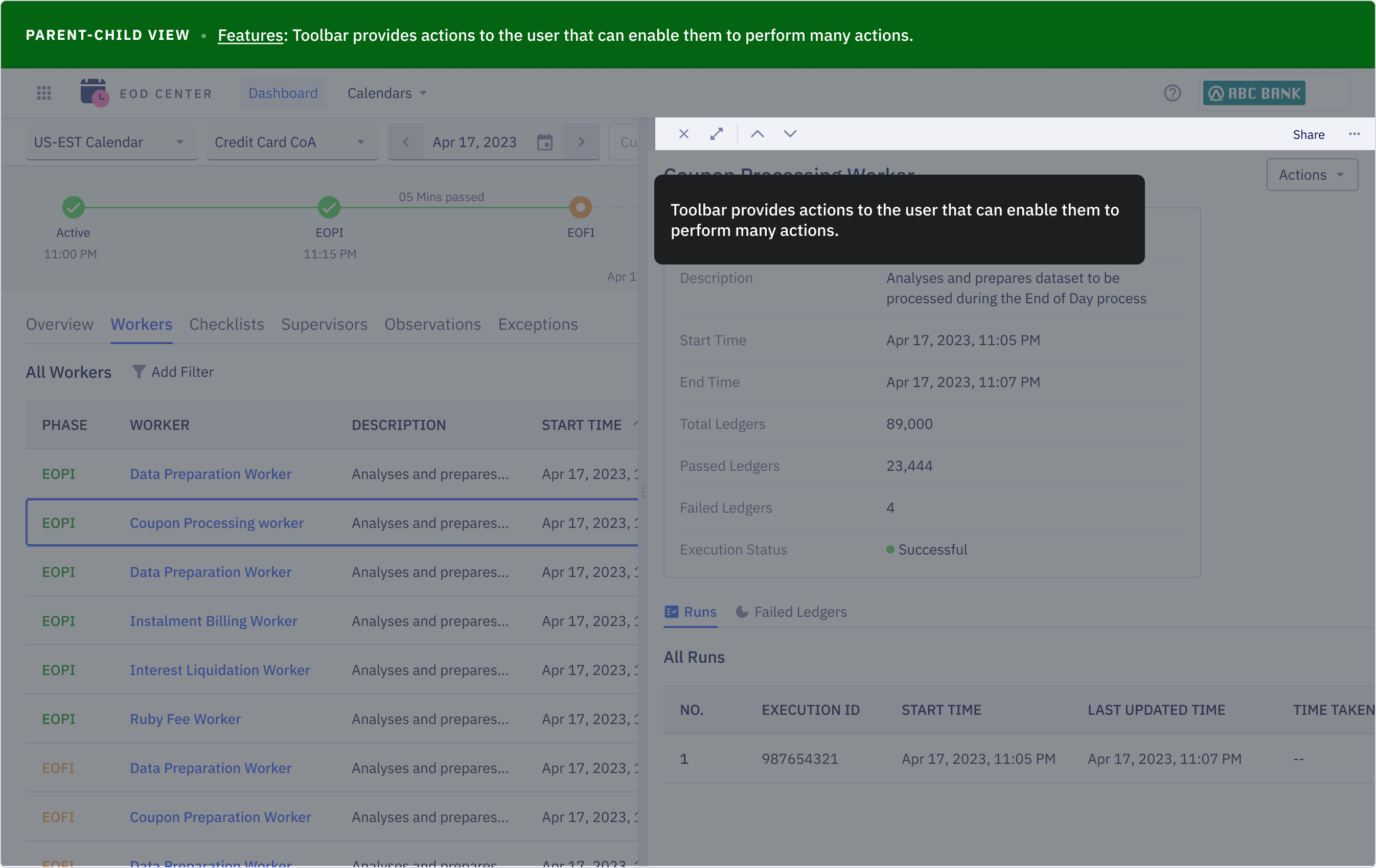
  • Parent-child view. A list, and a child container that opens beside it. The parent stays fully interactable and takes a horizontal scroll, so picking a different row repopulates the same panel instead of navigating away. The container carries a draggable handle, minimum width 30% of the viewport and maximum 70%.
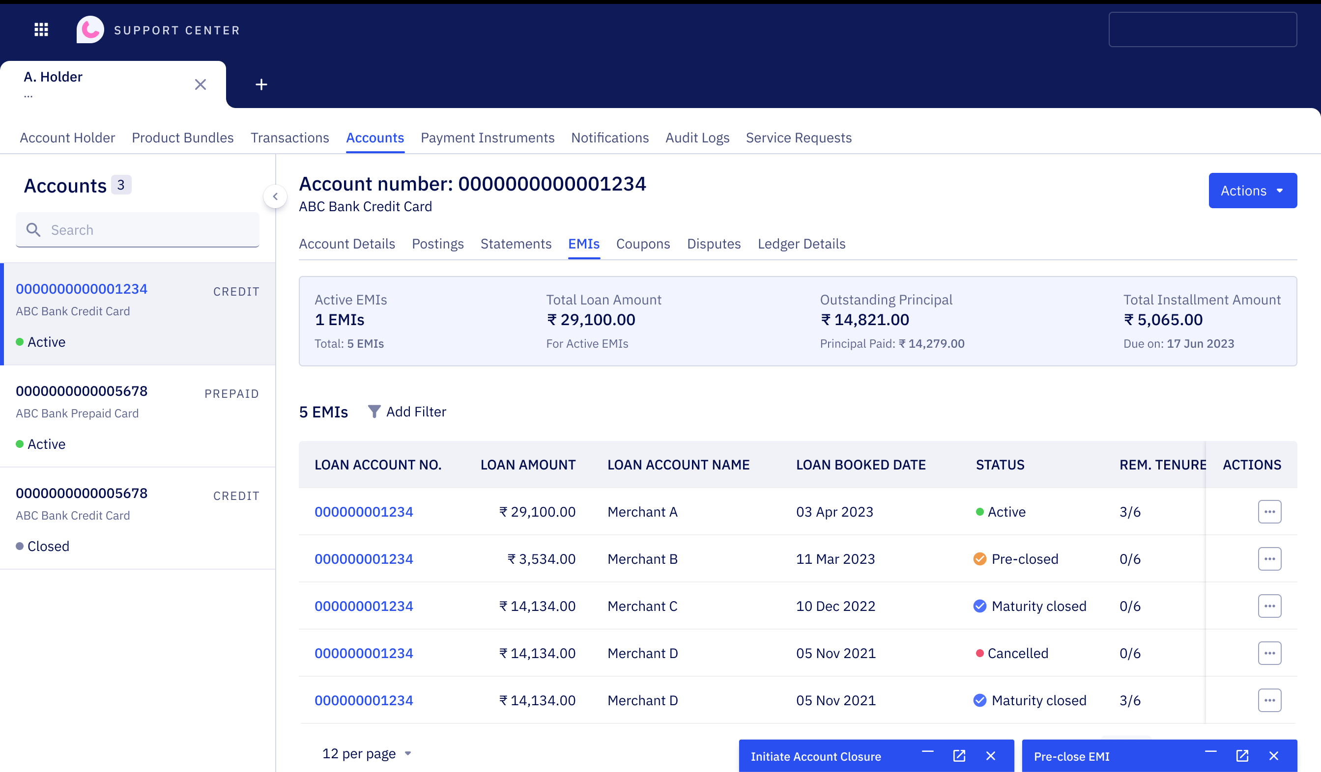
  • Floating compose box. A form that opens over the page at the bottom right, 16 px in from the edge, at most 60% of the viewport high, its minimum width set by the fields it holds plus its margins. It moves by its header and minimises into a dock along the bottom. A long form, dispute intake for one, opens as the same box full screen and minimises to the same dock.
  • Side panel. A form docked beside the page content for work that needs the page as reference. An ops agent fills a resolution while reading what happened before it, with an on-this-page index down the right to reach any supporting section.

The dock is where the rules live. Several forms can sit in it, only one can be open at a time, and opening one minimises the other. A box stays open while the agent moves around a single account holder, and every box closes when the agent switches to a different one. That last rule is the surface’s boundary, written down rather than left to each implementation.

A walkthrough frame of EOD Center: a green caption bar across the top, a table of end-of-day workers on the left, the selected worker’s run details in a child container on the right, and a dark tooltip over the toolbar explaining its actions.
Parent-child in EOD Center, as a frame from the walkthrough deck, with the deck’s own caption bar and a callout on the toolbar.
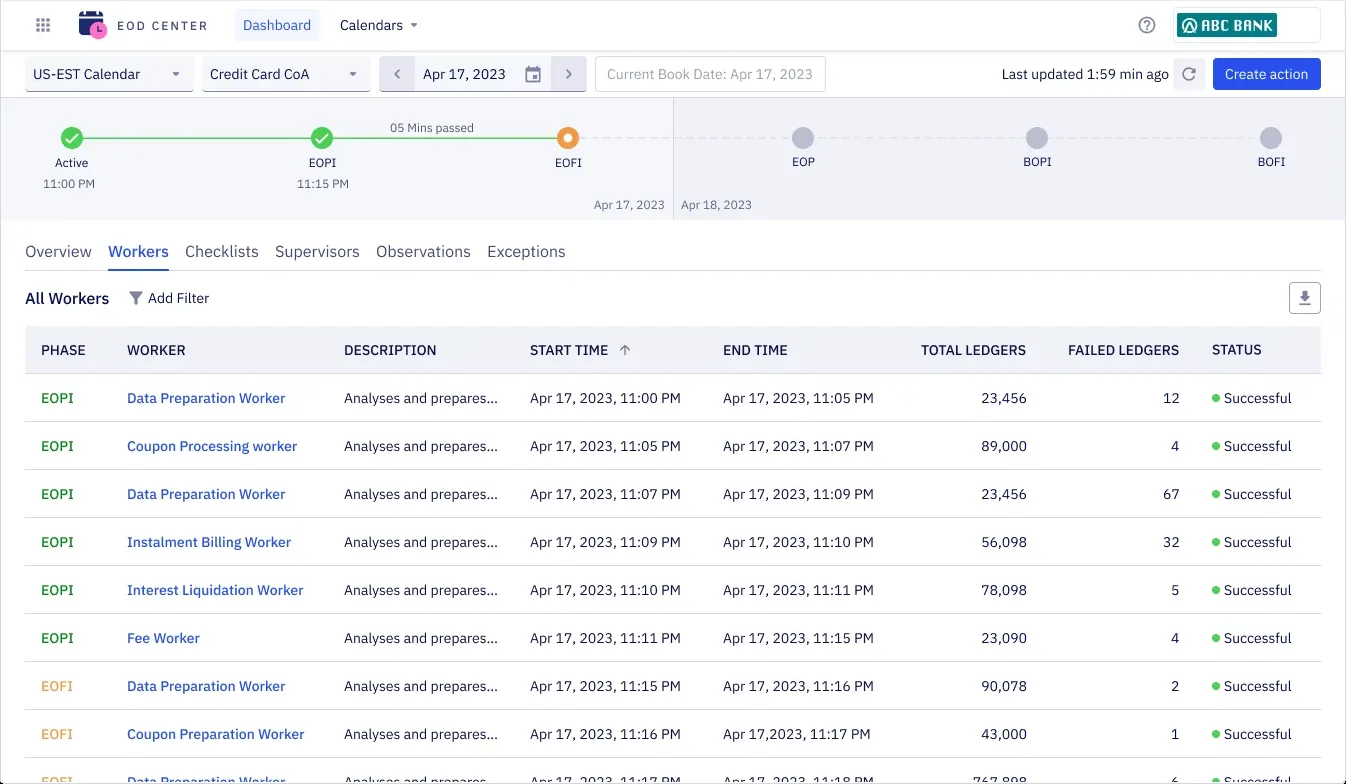
EOD Center dashboard showing a Workers table with no row selected and no child panel open.

PARENT-CHILD VIEW Story: User wants to quickly go over the details of the listings, and get into specifics when necessary.

1 / 7

The four flows from the deck, stepped frame by frame. Captions are the deck’s own. Screens are redacted.

04

Every center, one behaviour

The second question, the one about navigating and sharing an entity, is answered by a rule rather than by a surface. All business entities should be referenceable, and a center should not become the limitation for viewing them.

Under that sits how the pages are built. A page is a unique route, and the pages are microfrontends. A microfrontend is a whole page, or a fragment of one that another team drops into the page they are developing, implemented independently. So a surface can open an entity wherever the agent already is, and a shared entity URL always opens in a center. A component explorer that would let an entity be viewed independently of any center was proposed alongside this, view only in its first iteration.

The surfaces shipped, and every product center inherited them, across all verticals. The eligibility rules for an action now read as copy inside the box that performs it. Account closure names three: no active EMIs, no active disputes, a zero or positive reward balance.

The routing model drawn: one center’s page URL with three entity fragments nested inside it, the same three entities addressed on their own beneath it, and a note on the boundary: a form opened for one account holder closes when you move to another.
The routing model, redrawn from the deck. The internal address is genericised.
Support Center with two forms minimised into the bottom dock, an account closure and an EMI pre-closure, while the table behind them stays readable. Account details and brand names redacted.
After

The counts on this page are my recollection, accurate to the scenario. Screens are redacted: account details, third-party brands and internal addresses are replaced or removed.

Got something half-defined and difficult? Those are the ones I want.

maruti.avantsa@gmail.com