Work 04 2021 Self-set brief

Mavan Financial

Eighty services on my own map of what a bank sells. The tab bar changes with the product you are in, so the app never becomes a menu of everything.

My job was to fit eighty services into one tab bar without turning the app into a menu.

The map, drawn: five columns of what a bank sells, banking, lending and deposits, investments, insurance and the rest, eighty lines between them.
five verticals, eighty lines no one wants all of it at once everything a bank sells
Before The map, drawn: five columns of what a bank sells, banking, lending and deposits, investments, insurance and the rest, eighty lines between them.
Role
Self-set brief
Year
2021
Kind
Concept
Code
P–001

01

An executive asked how dozens of services fit in one app

Mavan Financial is a bank I made up in 2021, so I had something to design against. I set the brief myself, with no client. The bank sells five things: accounts, cards, investments, loans and insurance.

The question came from a senior executive where I worked at the time. I had been asking people about their banking apps, and the question came back at me.

Two of the pains I wrote down stayed with me. People did not understand how their app was put together, and they could not find the one action they needed in a hurry. Both of those are the navigation’s fault.

How do we put dozens of bank services in one app and still have it be easy to use?

A senior executive at the company I worked for then

02

Two of the three layouts made the first screen carry the whole bank

The map ran to eighty services in five columns: banking, lending and deposits, investments, insurance, and everything else a bank puts its name on. I counted them off that map, my own drawing of the industry.

I laid the same bank out three ways. A side sheet puts every destination behind a hamburger, so the list grows every time the bank sells something new. A card home makes the first screen a directory, and a visitor reads the lobby before doing anything.

The third changes the bar with the product you are in. All three were drawn and put in front of people.

The three layouts, redrawn: a side sheet listing every destination behind a hamburger, a home screen of service cards, and a five-seat bar whose middle seats change with the product.
The three low-fidelity layouts from 2021, redrawn in this site’s hand. Counts and action names are mine.

03

The bar changes with the product

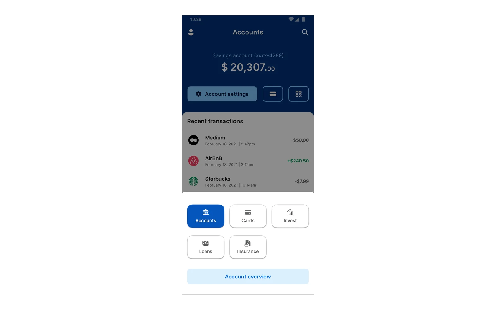
The bar has five seats. Seat one names the product you are in and opens the switcher, seats two to four are that product’s own actions, and seat five is More, which holds what every product shares.

In Accounts the middle seats read Overview, Pay and Services. In Cards they read Overview, Rewards and Services; in Invest, Explore, Portfolio and The Wall; in Loans, Explore, Repayment and The Wall. Adding a sixth product costs three labels.

Insurance is a tile in the switcher and a block on the overview. I never designed past that.

Tap a product and the middle seats re-label. The labels are the ones on the 2021 screens; insurance stops at the tile.

04

The first people who tried it asked for a page in front

The first prototype dropped straight into Accounts. The people I showed it to came back with two versions of one question. What if I want to land on my investments instead, and how do I see how everything is doing without walking through every product?

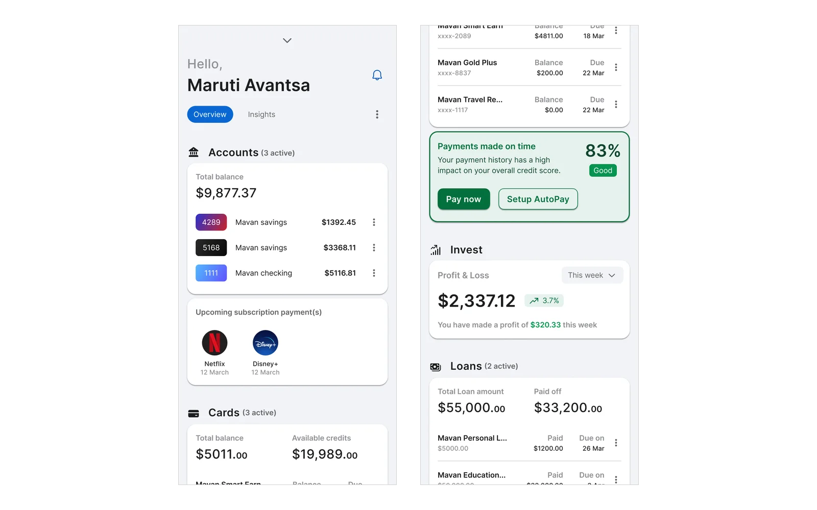
The account overview is the answer. It is the page after login: balances, subscriptions due, what each card owes, the week’s profit and loss, the loans. Each block opens into its own product.

A visitor can reorder that feed or drop a section out of it. Someone who never looks at loans stops being shown loans.

Two screens’ worth of the account overview: the balance, accounts and subscriptions due, then the cards, the week’s investment profit and loss, and the loans.
The page after login, two screens’ worth. Every balance and card on it is made up; the name at the top is mine.

05

Only payments was built to the end

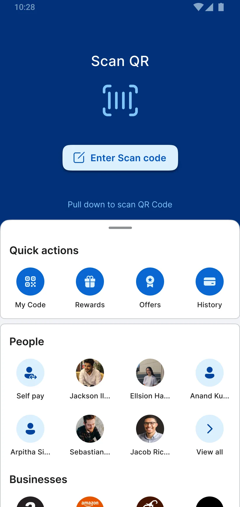
Payments is the one flow I took to the end. Pay opens on a code to scan, the quick actions and the people paid before, with businesses, bills and subscriptions below.

Services holds what a branch usually handles: bank to bank transfers, quick deposits, cheque services, ATM cash, a banker’s cheque, a demand draft, and the emergency actions for blocking a card or freezing payments.

Transactions lists what has gone out, and one transaction opens to a receipt to share and a dispute to raise. The rest of the app is screens, not flows. What I never worked out is trust and security, which is where a real bank would have started.

The Pay screen: a Scan QR panel at the top, a row of quick actions, and the people paid before.

PAY SOMEONE Pay opens on scanning a code, the quick actions and the people paid before.

1 / 8

The payment flow stepped frame by frame, and the card screens as far as they were wired. Names, balances and merchants are sample data.
The switcher sheet over the Accounts screen, as the app presents it: five product tiles with Accounts current, and a link to the account overview.
After

Concept work. Mavan Financial is not a real bank. Every balance and card on these screens is invented, and the account holder is me. The brief was mine, set in 2021 with no client. The executive’s question is paraphrased from memory and attributed by role only. The service count is off a map I drew, not a product inventory. The statistics in the original deck are other people’s, so they are not on this page.